

“A photograph is usually looked at — seldom looked into.” — Ansel Adams
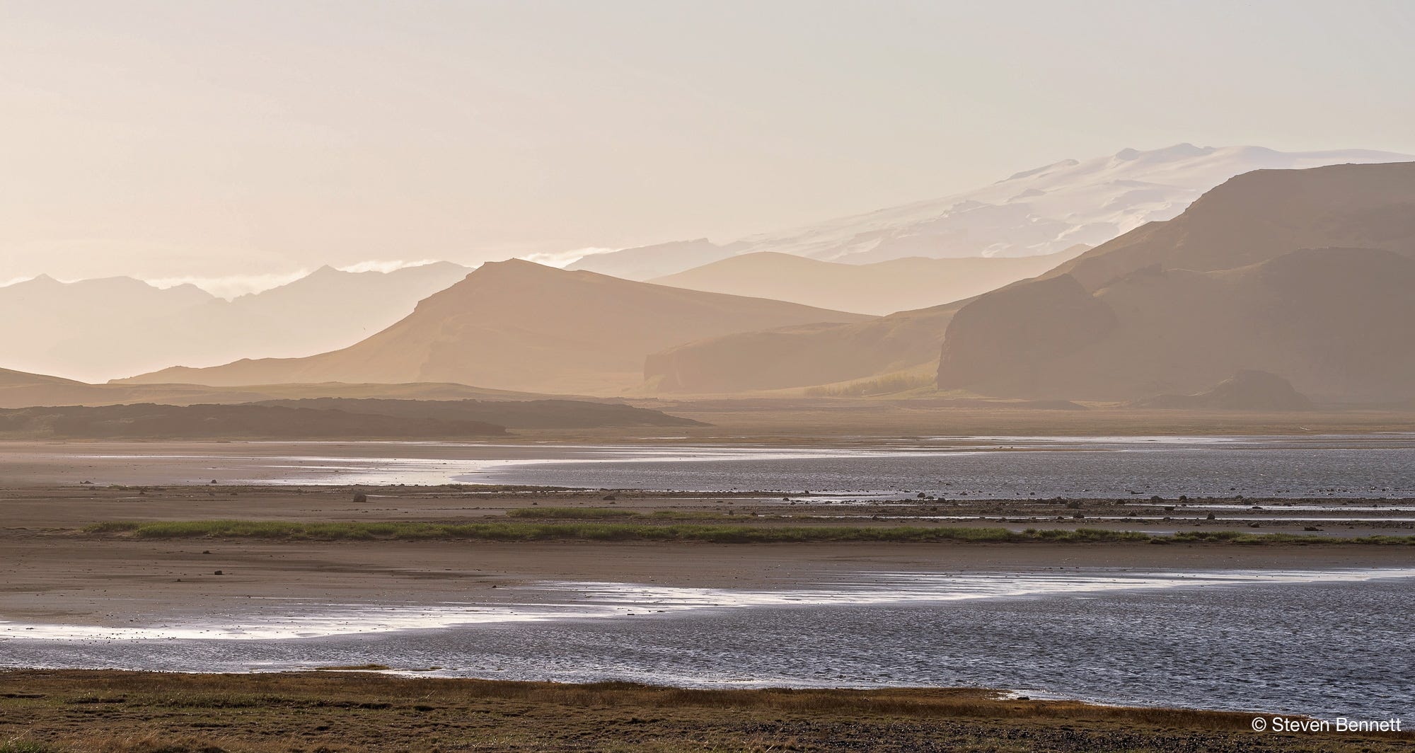
Your Eyes: What Do You See?
First Impressions
What does your gut say?
What pulls you in first?
How do you read the image — overall warm or cool?
How does the image make you feel?
Longer Look
Now that you’ve spent a little more time with the photograph…
Close your eyes for 5 seconds — what else do you see once you open them?
At first blush, everything is homogeneously hazy. What details emerge from a longer look?
Follow the strip of green cutting across the middle distance. Does it provide a temporary pause, or does your eye slide over it? If you see it as an invitation to pause, what else do you notice before your eye moves on?
At what point does the known landscape dissolve into the ineffable? And what do you imagine might be in that space?
My Eyes: Behind the Photograph
Terra Obscura shows the view that greets you as you drive down the road from Dyrhólaey, a 120-meter volcanic headland on Iceland's south coast near the village of Vík (Vík í Mýrdal). The scene begs hitting the brakes and stepping out to meditate on the landforms (and to enjoy relief from the intense winds atop the promontory).
A Microcosm of the Land of Fire and Ice
Beyond its sheer beauty, the scene was alluring because it captured the polar opposites I'd use to describe the country. In the blink of an eye the sky can change from bright blue and clear to cloudy and mysterious, from welcoming to hostile, and gentle to foreboding. Had I stayed ten minutes longer I likely would have left with ten very different images. I'll save that exercise for a future trip.
Color or B&W
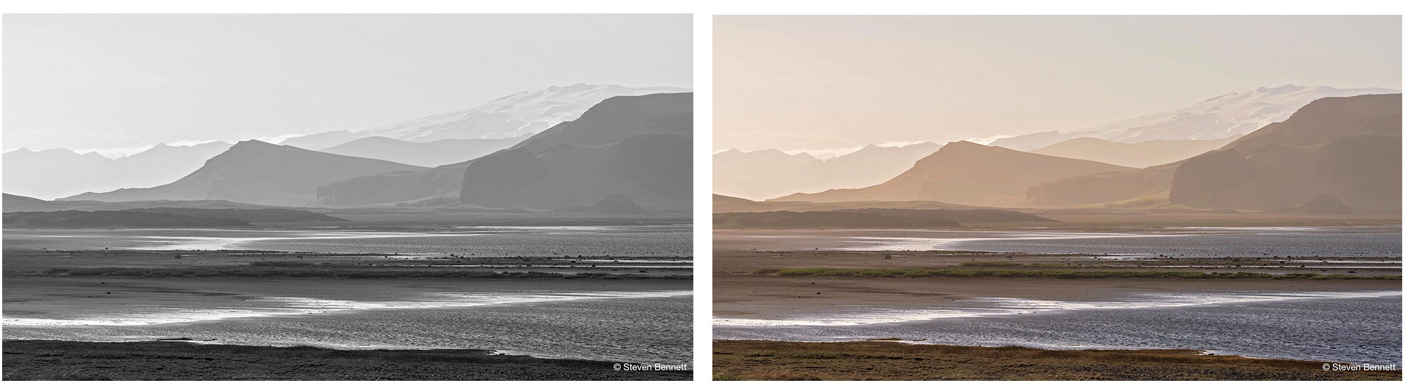
I had initially visualized the photograph in black and white, and planned on converting it in post production. Black and white would have been well suited for a minimalist presentation of a scene built on layers dissolving into haze. But I was surprised at how much the color version resonated. The palette was so narrow — tans, browns, one thin band of green — that it already reads as nearly monochrome, with just a trace of warmth. Here’s the black and white and color side by side. Which do you prefer?
The Medium Impacts the Message
While I print most of my work on metal, this photo called for paper. Metal gives color a glossy, high-contrast punch. It’s dramatic, but tends to flatten subtle tonal shifts. And this image is all about subtle color variations in the water and the landforms. When visitors to my studio ask if I exclusively print on metal (most of the works on my walls are printed on aluminum), I show them the framed color version of Terra Obscura and ask them to trace the various tonal transitions. This always generates an “aha” and a greater appreciation of the photograph. And it’s a good reminder that the medium is more than a substrate for the image; it often determines what you can and cannot see.
“Everything we see hides another thing; we always want to see what is hidden by what we see.” — René Magritte, 1965 radio interview with Jean Neyens
While the color prompts mixed responses from me - both warm and cool, it is the black and white version which envelops me - invites me to jump in whole, without conflict or confusion of thought or emotion. For me the B&W is more immersive - a more complete experience. Both are spectacularly rewarding.
The soft muted colors are rich and warming. As I look, I find 11 different planes, each at greater distance to the horizon. By the second or third plane, the landscape begins to look surreal.
As always, very nice Steve